The Lafayette Family Room
The Lafayette Family Room is a square room, approximately 16x16, and it sits adjacent to the dining room and open kitchen. It is the main hub of the home, and as you can imagine, with a rambunctious 5 year old boy and a 10 month baby girl, it is often full of toys.
We were impressed with the base pieces that the family had chosen. There is an obvious passion for design and we liked what we had to work with. Here is where we started.
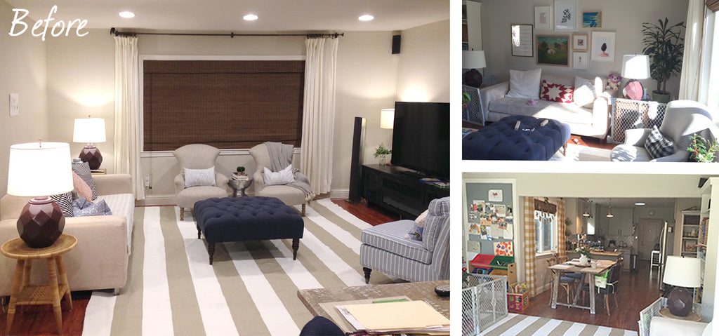
Not a terrible start at all.
The key areas that needed improvement included a better space plan for seating and television placement, a cohesion in the drapery from room to room, and lastly that final layer that really pulls it all together; the accessories.
| THINGS WE LIKE | THINGS WE DON'T LIKE |
|
|
Let's explore the space plan we drummed up.

Plans & renderings seen here are drawn roughly to scale based on measurements provided.
Here We Go!
FURNITURE & TELEVISION PLACEMENT
We sought to solve the space plan woes for the family by floating the seating pit in the middle of the room.
Starting with the existing striped 10x14 rug as our anchor, we centered it in the room, just below the window. We suggest extending the curtains to 120" to help frame the seating area, though the window is only 96" wide. We then suggest floating the furniture inside that 120" area.
Consider a vintage kilim rug layered on top for added texture and visual interest.
- We suggest centering the layered rug according to the final sofa & coffee table dimensions.
- These dimensions are all affected by one another, but ideally the coffee table should be centered over the rug, positioned roughly 16-18" away from each seat, (Note the large gap in the former arrangement.)
- Whether on or off, the rug should ideally have the front legs of each furniture piece equidistant from the rug's edge. We suggest on.
There should always be a flat surface within reach of every seat, so the homeowner's existing mix of side tables should serve perfectly once mixed in with the new seating layout.

| A PROBLEM | A SOLUTION |
| We did discuss some apprehension over the TV becoming the main focus in the room. There really were only two options for placement and the homeowner had tried both. Of the two, the one pictured in our before image above was not working functionally, while centering it on the other wall gave it too much prominence. | Our solution instead, is to create a larger focus that the TV can be a part of. By grouping the wall-mounted device among the art gallery scenario, and flanking it by two floor to ceiling shelving units, along with a low profile console (all in white) the entire wall becomes a showpiece. |
Moving on to other To Dos!

ADD A DINING ROOM BANQUETTE
We couldn't help ourselves, and so we pushed beyond the boundary of the family room a bit. One of the casualties of the former space included the dining table encroaching into the family room zone. We love us a good dining banquette, so we tossed it into the floor plan just to see. We love it.
- An appropriately sized bench or a built in banquette under the window will create a fantastic feature that is both on trend plus will help maximize space between the rooms.
-
We do suggest considering a statement pendant for above the dining table, but consideration of the proximity to the kitchen peninsula pendants is important.
"Watch out it doesn't turn into pendant city." - We noticed the homeowner's peninsula countertop has a rather large lip unlike our rendering. Our suggestion is avoid placing bench seating below, but a customized built in could accommodate.

CREATE FOCUS
- Make the TV part of a gallery wall to take the focus off of the device itself
- Center a low and long console, then flank with floor to ceiling bookshelves
- Style with existing matching lamps or spring for new lamps in a more petite, traditional shape
- We think you might even be able to camouflage the large speakers among this setup.

CREATE BALANCE & COHESION
- Float the rug and furniture in the middle of the room
- Match the 3 window dressings between rooms
- Create a storage feature along the back wall to help balance the weight of the TV focus wall
| A PROBLEM | A SOLUTION |
|
The homeowner had doubts about hanging the drapery.
|
We think she had the height and the width right for the hardware, but would benefit from a bit more length in the drape itself. They should kiss the floor, rather than hang a couple of inches above
|
|
We also noted that the sliding glass door on the adjacent wall appears bare in comparison, while the dining room window in the next room was another disparate pattern, making the spaces feel disjointed.
|
Matching floor to ceiling drapes on all three windows will create a more cohesive look, tying the spaces together.
The grass shade can be eliminated for the sake of functionality on the sliding glass door, but is present on the two windows. Push all drapes to the left for easy access in and out of doors. |
Now for my favorite part, the decorating!
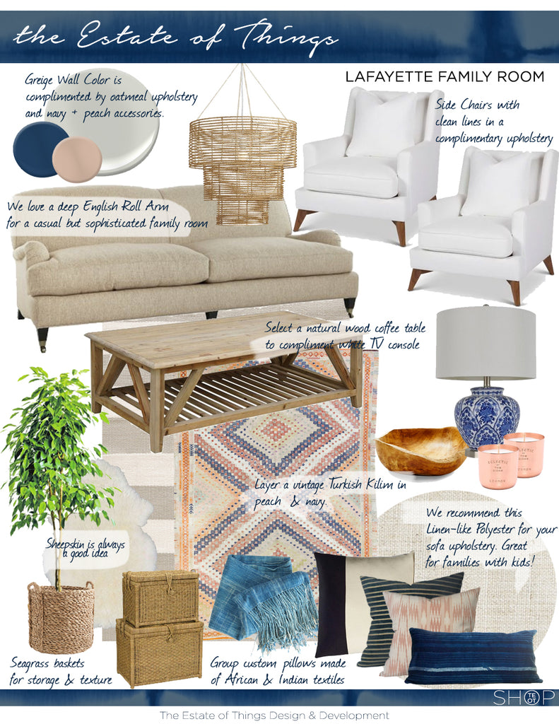
We focused on a merge between Farmhouse Modern touches but with a California casual sophistication. Here is how that breaks down.
- FIND A COLOR SCHEME TO FOCUS ON!
We honed in on a navy and peach color scheme for the accessories, largely due to this insanely beautiful vintage kilim rug that Sarah found. It's just the right punch for layering along with the stripes, and not too distracting, which was something we had to consider with the striped layer. It's not a hard and fast rule to put ONLY navy and peach in the room, its just a good guide when selected the art and the accessories and styling them throughout the room. - BRING IN THE TEXTURE!
Mixing in natural elements helps to achieve a warm depth to the design. - Wood & Seagrass
The coffee table, the baskets, the teak wood bowl and any art gallery frames will keep the overall vibe earthy and down home. We are leaning towards the warm pines and lighter Scandinavian farmhouse tones when it comes to the wood elements. - Fur & Textiles
The deep textures of the vintage textiles, from the silk of a handwoven ikat to the nubby quality of the handwoven and hand-dyed mudcloth, play together nicely. The textural fringe of the denim mudcloth juxtaposed with a sheepskin to toss about is never a bad idea. Over the back of a chair, the side of the sofa, over top a round pouf for extra seating... pieces like this can be very versatile and promise to good anywhere they land in the room. - Metals
Copper also adds another layer of depth to this design with the added benefit of sticking to the overall color vibe. - SELECT A BASE UPHOLSTERY
We are leaning towards a performance linen-like polyester for this home with young kids. The family needs "light and airy," but when it's peanut butter and jelly time, they also need to be able to keep it clean. This 95% polyester / 5% linen upholstery should do the trick for that 8 feet of radical luxe English Roll Arm sofa we suggested.
As always, we pulled out some individual items for our homeowner to consider for purchase, along with a corresponding Pinterest Board, seen here. Items can be shopped directly from the list, or used as mere suggestions.
